Showing posts with label sketch sunday. Show all posts

Sunday, February 21, 2010

Sketch Sunday 15

I love alliums. :)


In the picture above, I wanted to draw a caricature/chibi-like cartoon of a garlic girl. I was inspired by this sketch my friend Alex (aka o_8) posted a few months back (check out his DA gallery—really great character design work). I added a few more alliums behind her (which look more like onions than garlic) to suggest that garlic lovers love the company of other garlic lovers, and that one must never be the only eater of garlics. ;)

When I first began traditional drawing lessons, my instructor always emphasized copying what you see exactly as you see it. Later, I understood that this not only trains the drawing hand, but it also helps you learn about the object you are drawing.


I recently read this great article by Mark Kennedy (storyboard artist on Hercules and Tarzan) that emphasizes the importance for aspiring artists to carry a sketchbook around. His main point is this: you don't carry a sketchbook around to draw pretty pictures in it. You will end up with drawings you won't like.

Sketching your surroundings is a great way to learn because you are forced to slow down and analyze your subject extensively. The act of copying a shape or structure helps commit it to memory, and you learn about its spatial relationships, functions, and movements. Our lives move so fast these days that we rarely slow down to appreciate the little details. Spending a few hours sketching is a great way to do that. 

A lot of people shy away from copying things—especially other people's drawings—because they believe that sketches from the imagination are more "valid." While this is true of most major finished pieces that are intended for galleries and such, nothing could be further from the truth if you are still in the learning phase. 

If you are burgeoning in your art career (or hobby!) and have the resources for it, I highly recommend finding a mentor. Their insights can guide you away from mistakes and challenge your talents. Most artists are more than happy to share their bits of wisdom, so go search the 'net for blog posts and articles. 

If I could offer one piece of advice on learning to draw, it would be: Learn by copying. Imitate pictures and styles that inspire you, and try to understand why you find them so attractive. If you are a beginner, start by copying shapes, then move on to shades, then colors. Once you have a firm grip on the basics, you can then try to explore with different styles of expression. 

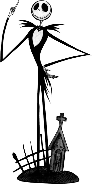
At the end of Mark Kennedy's blog post, he brings up silhouettes, which reminded me of this article about the importance of silhouettes in logo design. In short, great logo design, like great character design, excels when recognized simply as a shape without any details. Naturally, I was curious as to how my little garlic fared as an outline. 


Does she still look like a garlic girl? Can you still recognize her? I'll let you decide... 

(By the way, if you are interested in a great online digital drawing community, check out our sister site, 2draw.)

Sunday, February 7, 2010

Sketch Sunday 14


Inspiration comes in many forms. The etymology of the word comes from Latin for "to breathe" and many inspirational things can be said to "take your breath away." Inspiration arouses the mind and cultivates passions for interesting or beautiful things. It transforms us from dull vapid beings into spirited creative thinkers.


Drawing is one of my passions. In today's Sketch Sunday, I showcase three sketches I did around New Year's. The female body is my favorite subject, and with every drawing, I try to learn or do something new. Here, I set a different mood for each picture. By playing with various expressions of the eyes, lips, and posture, I create looks that can say cute or sultry, shy or demanding. While drawing, for me, is the primary component of my creative outlet, I also try to brush up on other aspects of art to be well-rounded.


Inspirimint is the garden where these new ideas can be cultivated, for both myself and everybody else. I like the idea of this virtual garden because, like gardening, creativity is also built on a lot of research and hard work, and needs to be nurtured before ideas form and blossom into a satisfying product.

Inspirimint is not a product. It's a work in process by which new ideas and projects excite people to pursue their interests, try something different, or learn about wonders from all aspects of life.

We are finally coming out of our winter hibernation. Happy 2010! :) What inspires you?

Sunday, July 26, 2009

Sketch Sunday 13

A couple of weeks ago, Engadget posted a design contest. The winners would get their design laser-etched on the back of a Kindle. The contest closed on Friday, and I decided on Wednesday night to give it a shot...

Thursday morning rolled around and I went to work with a vague idea of what I wanted to do. I printed out an image of the kindle back and drew these layouts.

The first sketch.

The second sketch.

When I got home Thursday night, I traced the first sketch in order to scan the lineart. Since it was drawn on top of a very dark print-out, it would have been very difficult to manipulate.

Trace of first sketch.

The face of the trace superimposed on the tree from the second sketch.

By the end of the evening on Thursday, I had the image scanned onto my computer, and I had began inking it using Flash CS4. One of the rules for the submissions was that the final image must be in vector format. I had the choice between using Adobe Illustrator or Flash, and chose Flash because it's pretty hard to sketch in Illustrator and someone suggested that I try it out.

The image manipulated in Flash.

During the course of the day on Friday, I realized that the image was due at 11:59PM ET, not PST where I'm at. I got home at 6 and saw that I had a little over 2 hours to work on the image, not the full 5 I was banking on. Our resident programmer helped out by writing a small piece of code to generate the random texts in the tree. The image below is the final design and what it would look like on the back of a Kindle 2, should it be selected as one of the winning pieces!

Click to enlargenize!

The tree was inspired by the designs on the back of the original Kindle. I think the flow came out really well, but I wish I had those extra 3 hours to smooth out some details.

The winners of the contest will be chosen by voters, so please check back in the near future for a link to the voting page. I hope my design is selected! I would really love to see this picture laser-etched onto a Kindle.

Sunday, July 19, 2009

Sketch Sunday 12

Wine label design.

My dad bought and planted about one hundred wine grape vines on our property a couple of years ago, and we picked them last year for the first time. We didn't get a lot, but there was enough to make a few bottles of wine. I was the designated label designer.

On a previous Sketch Sunday, I posted my brainstorming sketches:

Brainstorming sketches.

After a few pages of doodling, I developed some ideas about how to proceed, but it wasn't until after the corking process that we decided upon the name of the wine. I opened up Illustrator and began making vector shapes on a 4" x 4.5" canvas.

I started by just putting the necessary text—the logo, name, year, etc. After moving the words around, I felt comfortable enough with the overall balance of the text to start embellishing the label by adding some background elements.

The first iteration on Adobe Illustrator.

The second iteration.

Since I am relatively new to Illustrator, I went for a simple, clean, and modern look, using basic shapes, colors, and blending techniques. I tried to get a good balance of light and dark, text and white space, and different colors, and used repeated motifs to tie the whole label together.

The final design!

When the design was finalized, I printed the labels out, trimmed them, and glued them on the bottles! Check out these beauties. :)

The final product!

The wine is very good for a first attempt. Since the vines are only 2-3 years old, the flavors are not as strong and the taste has "young vines" written all over it (according to one of my connoisseur colleagues). The color is a brilliant dark red with purple hints, and the wine tastes moderately sweet and acidic. In case you can't tell, the text at the bottom of the label reads: Brix 21.2 - TA 0.85 - pH 3.96 - Alc. 12.2%.

Here are some photos from the whole process:

Wine grape-picking, Aug 2008.


Cabernet grapes on the vine.

The tiny first year harvest with grape crusher & barrel in the back.

Wine bottling session, May 2009.

Transfer from carboy to bottle.

Can you see the nice dark red? It couldn't be captured well on photo.

The corking process... guess how the wine name came about! ;)

Our eclectic mix of only 22 bottles.

It was my dad's dream to have his own vineyard, and he made it possible with a lot of research and hard work. I want to congratulate him on a job well-done and thank him for the fun experience. Cheers, and to next year!

Sunday, June 21, 2009

Sketch Sunday 11

A couple of weeks ago I went to Maker Faire at the San Mateo Convention Center to help Ambidextrous Magazine promote their upcoming issue titled "Space." I was invited to put together a collage of the editors. Since the theme was "space," I decided to draw them as astronauts and aliens!

Editor's photo collage for Ambidextrous magazine issue 11: Space

I started out with crops of each person's head, floating over a black background. Then I sketched out pose ideas for each of them, rotating heads to fit the composition of the big picture. The stars, comets, moon, and planets in the background are all Photoshop brushes that I once downloaded, but can no longer recall from where. Eventually, colors and other details were added, to yield this final product!

The most difficult part of this picture was dealing with the silly artsy people who sent in their photos in black and white. Were they trying to be classy? Emo? Maybe, but who knows. It was too bad because I added color to them anyway. Can you tell which heads were colored by hand? Hopefully not, because that means I did a good job. ;)

Ambidextrous is Stanford University's journal of design. I know a few people that work on it, and volunteered to help out with this image. The magazine is run entirely by students and features some really great articles on design and the design process. Most of the articles are written by professionals in the field, and cover a wide range of subjects about design concepts.

If you are interested, check out their website for article previews!

The questions they pose to the greater design community relate to the broader design process, and not just a single aspect like industrial or graphic design. For example, issue 10 ("Getting it On") covers topics from condoms to the evolution of the zipper.

One thing I really like about the magazine is that each issue has a centerfold called Functional Dissection where they take apart some device and document the process. In issue 8 ("Secret"), the Ambidextrous team took apart a combination lock to show us what made it click. Other issues broke apart roombas, polaroid cameras, and even a nail gun.

If you are interested in reading more about Maker Faire, check out my friend Paula's recent blog post at Quite Curious! She provides a great account of it, and has some great photographs as well.

Sunday, May 17, 2009

Sketch Sunday 10

This weekend, to avoid the stress and hassle of finding parking (and actually parking) in San Francisco, I took a long relaxing ride on the train to meet some friends there. I was recently inspired by Shane Glines' cartoon pin-up girls, and sketched a few big-headed, long-legged girls on the way up. The train ride was very bumpy, but luckily there were many stops along the way. During the bumpy part of the ride, I would draw the rough underlying sketch with my red pencil, and then quickly overlay a few strokes of pencil lineart at the stations.

In addition to being a foxy lady, the girl in the sketch above must also have some serious muscles, because that pose looks pretty difficult to hold. It was really fun to draw curvy legs on these ladies, which is probably why I drew them a little longer and more slender than usual. One of the main reasons I like drawing girls over guys is because they have a lot more accentuated curves. This makes the poses much more dramatic and gives their shape much more depth.

So why are drawings that are grossly disproportionate compared to a normal human body still acceptable as cartoons? I was thinking about this and realized how many cartoon characters have giant heads, big eyes, or long slender appendages, and I began to wonder what kinds of proportions work, and which ones don't.

I was reminded of the sensory homunculus, which is used in psychology and neurology to depict which body parts require the most neurons to sense. In cartoons, however, it seems to me that the body parts are exaggerated based on how they are perceived. For example, since people pay a lot of attention to the details of another person's eyes, it does not seem unusual for cartoons to have larger-than-normal eyes. I think that the length of the arms is compared mostly to the length of the legs, and not to the size of the head or body, which is why Dee-Dee's and Jack Skellington's arms and legs are long and slender, independent of the size of their heads or bodies.

Anyhow, these observations are simply based on my own drawing experiences and not anything more scientific. If you have any more interesting insight or details, please share!

Sunday, March 29, 2009

Sketch Sunday 9

I'm not super tech-savvy, but I do think that I can make a better masthead than the one we have at the moment. During boring meetings, I like practicing my handwriting, usually by writing certain words or combinations of letters over and over again. After writing "inspirimint" over and over again, I've decided that I like this combination of letters.


Creating a logo or signature takes a lot of creative thought and development time. My dad gave me the task of creating a label for his wine. The vineyard is very young—last summer was our first harvest, and we will bottle wine for the first time this upcoming summer. This year, we harvested enough grapes for less than 5 gallons of wine from our young vines. On Friday, we tried a glass of both his wine and the neighbors' , who have been doing this for decades. To my (pleasant) surprise, his wine tasted a lot better than our neighbors'!

Graphic design and illustration are very disparate fields, and although I have drawn for so many years, I feel like I don't have the right skill set for logo design yet. I remember reading and being inspired by this article a while back, so I started out by just sketching a bunch of ideas without really committing to anything. In fact I began by simply writing the word "Casa" over and over again. By the time I got to my third page, I could feel the flow of the word better, and was building more on its shape.

This design is far from complete, and I will be working on this project for the next couple of months. If you have any suggestions as to how I should proceed or what more I can do with the label design, I would love to hear them! I am really proud of my dad for making such a wonderful wine, and want to support him by making the best wine label I can.

Here are two sketches of a chibi Elle Driver. I was trying something different—something more cartoon-y. I like her pose on the left, but I love her face and expression in the sketch on the right. Elle has such a great character design!


Last week, I also revisited this old sketch. I added a bit more line width and depth to this picture from the previous Sketch Sunday. Nothing too exciting, but I like the way the lines flow a lot more, so I thought I'd share it here.

Sunday, March 15, 2009

Sketch Sunday 8


This week, I started out drawing a girl with her hair blown in the wind, but the more I worked on it, the more it began to resemble Pepper Breeze by Artgerm. In this picture, I really wanted to draw heavily layered hair. I don't know why but I love drawing curly hair, even though I have such a hard time getting it to look right. Here, I got a little lazy with the curls which is why some parts look curly, while other parts only look wavy or even straight. As I was inking this picture, I was reminded why I like drawing girls with short hair. What kind of hair do you like drawing?

(This picture was inked using Copic brand pens and colored on photoshop.)

Sunday, March 1, 2009

Sketch Sunday 7


Hope everyone had a good week! Here are three doodles I did during a very boring meeting this week. It's always a fun challenge to sketch with only what you have. I used a company pen on the back of printed meeting notes to sketch these, but the biggest obstacle was drawing on my lap.

Sometimes when my mind wanders, I like to doodle poses. Most of the time they are simple and feminine, but sometimes I will try to work on things like perspective. The types of poses that transfer best from imagination to paper for me are things that I am familiar with. I have quite a few years of martial arts experience, and will often default to poses from kata, or forms. Does anyone else do this?


This week, I re-watched the second volume of the Kill Bill series. I really like Elle Driver's character design and did a sketch from her encounter with Budd. I feel like I should have explored more stylistic possibilities than I did with this sketch, but didn't realize it until I finished inking the picture. Don't you hate it when that happens? I guess there's always room to explore.

Sunday, February 15, 2009

Sketch Sunday 6


Today's sketch is inspired by the animated film I saw last night, Coraline. I first heard about the movie after learning that some artists I follow worked on it, but I had no idea that the entire movie was in 3-D! I had never seen a movie in 3-D before, and I was excited to seize the opportunity to do so (even though renting the glasses cost an extra $2).

Stop-motion animation is incredibly impressive when it's done well, and Coraline completely surpassed my expectations. The 3-D aspect of the movie definitely adds a "wow" factor. I remember back in the day when 3-D meant dorky red-and-blue glasses that completely distorted your vision and left you nauseated, but the glasses from last night worked so well I barely noticed them the whole movie!


The story follows Coraline, who had just moved into a haunted house and explores a magical "other" world. It was developed from a fantasy horror novella written by Neil Gaiman and there are definitely some really creepy themes present. I say this because a lot of parents associate animation with kids-friendly movies, but a lot of animated films nowadays are aimed at a much older age group.

In the magical world of Coraline, Coraline's "Other Mother" is obsessed with sewing buttons onto her eyes. For this movie fan-art, I wanted to incorporate the creepy buttons into the drawing somehow.

First I laid down my usual rough layer in red and drew in the final lines with a regular graphite pencil (top image). I then inked the drawing using bleed-safe pens and erased the pencil sketches (second image). The final picture below is colored with alcohol-based Copic and Tria markers which I find excellent for blending.


I normally do not use references for my drawings, but each time I do so, I recognize how they help me visualize the characters or settings. Even though I don't copy the drawing style, pose, or composition, references help by adding an extra layer of thought.

Here are a few pictures that I found pretty cool:


The photo above was probably the most inspiring. It gives you a great sense of scale of the movie—both how grand, in terms of the amount of work that was put into making each doll and facial expression, as well as how small and miniature the entire production set is.

All in all, it was a great movie.


Have you seen Coraline? If you did, what were your impressions about the set? Characters? Plot?

Related Links:

Sunday, February 8, 2009

Sketch Sunday 5


Collective nouns in animals:

A...
shrewdness of apes
dissimulation of birds
quiver of cobras
weyr of dragons
memory of elephants
fesnying of ferrets
glint of goldfish
bloat of hippopotami
scold of jays
mob of kangaroos
lounge of lizards
stud of mares
watch of nightingales
parliament of owls
ostentation of peacocks
bevy of quail
mischief of rats
harem of seals
knot of toads
generation of vipers
descent of woodpeckers
herd of yaks
zeal of zebras


Related links:

Sunday, February 1, 2009

Sketch Sunday 4

Skinny Jeans and Puppy

I guess for those Paris Hilton-type girls, a dog is just an accessory. In this week's sketch, I drew in the dog so that the girl's hand is not floating in space. Kinda the same idea, non?

I did very little to clean up this quick drawing. 15 minutes to lay down the red and then another 10-15 minutes using pencils to draw out the general curves and shapes.

After opening the drawing up in Photoshop, I puzzled for a moment as to what that random streak on the puppy's leg was... The tip of my red pencil had broken off and was caught in the sketchbook. It fell out while scanning.

Sunday, January 25, 2009

Sketch Sunday 3


Ginger is a Dreamer

Sketch Sunday is really helping me keep up my drawing. Are you drawing too? :-)

Before I draw a picture, I like to brainstorm. Sometimes I draw a small 1 to 2-inch thumbnail in the corner. This helps me visualize the pose and emphasis of the main curves. I've also gotten into the habit of jotting down words while I'm sketching. Sometimes it relates to the picture, other times my drawing becomes a notepad for a discussion with someone nearby (like trying to figure out what the seven deadly sins are).

Whip


This week, my style is influenced by animator Ronnie del Carmen. I love the way he uses solid colors in his slender girls drawings. I tried to make my girls more exaggerated and cartoon-y, but they came out more proportioned and detailed than planned—which is okay—that means there's more to explore in the future.

A Close Encounter at the Edge of the Woods (digital coloring of previous sketch sunday)